A fresh list of the best Linux distributions which offer lightweight Xfce desktop environments.
Xfce is a lightweight desktop environment focusing on speed, performance, and resource efficiency. It offers a clean and intuitive user interface without compromising functionality. It features the legacy icon and menu-driven user interface, which is time-tested for productivity. In addition, Xfce also allows users to personalize it according to their preferences.
Many Linux distributions feature Xfce as their flagship offering with various tweaks and customizations. If you love Xfce and want to adopt it for your daily driver, you may check out the below list of distributions.
The order is casually based on our recommendation and the freshness of the respective distros.
Table of Contents
Best Linux distributions with Xfce desktop
Debian with Xfce
Debian Linux, known for its stability and reliability, offers the default desktop environment as Xfce. When you install the Debian desktop ISO, it installs Xfce if you don’t choose anything particular.
This powerful combination of Debian and Xfce offers stability, security, and a vast software repository, making it excellent for all user bases. Whether you’re seeking a reliable desktop operating system or a stable platform for your server, Debian with Xfce provides a user-friendly experience that can be tailored to suit your specific needs.
If you don’t like Ubuntu but want to be in “apt” ecosystem with Xfce, you should consider Debian Linux with Xfce. It would be a perfect combination for productive and daily running distribution. Finally, you get to experience vanilla Xfce with this variant.
You can download the Debian Xfce ISO file from the below page.
Linux Mint Xfce edition
If you are a Linux Mint fan and want an Xfce desktop with it, then you should try its Xfce flavour. Although Mint’s flagship is the Cinnamon desktop, but Xfce is equally good.
Linux Mint Xfce edition brings a lot of cool Mint apps (Xapps), making the Xfce desktop more productive for you. The built-in customizations and themes also give a better look than the default Xfce feel.
In addition, you enjoy the advantage of seamless system updates, version upgrades and many system-level actions with just a few clicks. Linux Mint Xfce Edition provides a seamless and enjoyable computing experience overall and is probably the most stable and easy-to-use Xfce distro.
You can download Linux Mint Xfce ISO from the below link.
MX Linux
MX Linux is a popular and probably the most happening emerging distro, which got lots of users’ attention because of its versatility and simplicity. It is based on the Debian stable version and features a customized Xfce desktop.
At the core, MX Linux is free from Systemd. Hence you get a superfast distro that works in much older hardware with ease. MX Linux also features MX Tools to simplify various tasks which you want to perform on a desktop. These tools cover a range of functions, including system management, hardware setup, and package management, empowering users to customize their experience effortlessly.
Here are some key reasons why MX Linux is one of the worthy candidates in this list:
- Based on the Debian stable version
- Xfce desktop environment with option as Fluxbox
- Systemd free
- Excellent performance and stability
- Access to a vast software repository
- MX Tools for easy customization
Fedora Xfce Edition
If you are looking for Xfce with Fedora as the base, then you have limited options. One of the options is Fedora Xfce flavour which brings the latest packages and upgrades. Fedora Xfce usually offers the latest version of the Xfce desktop twice a year. In addition, Fedora Linux brings the latest tech upgrades and packages, making it the best choice for Xfce-based distribution.
The Xfce desktop in Fedora Linux is the stock version without any customization. Hence, you have a clean slate to customize Xfce desktop as per your taste and need. Furthermore, Fedora Linux brings an extensive software repository, offering a wide range of applications, libraries, and development tools.
You can download the Fedora Xfce edition from the below page.
Xubuntu
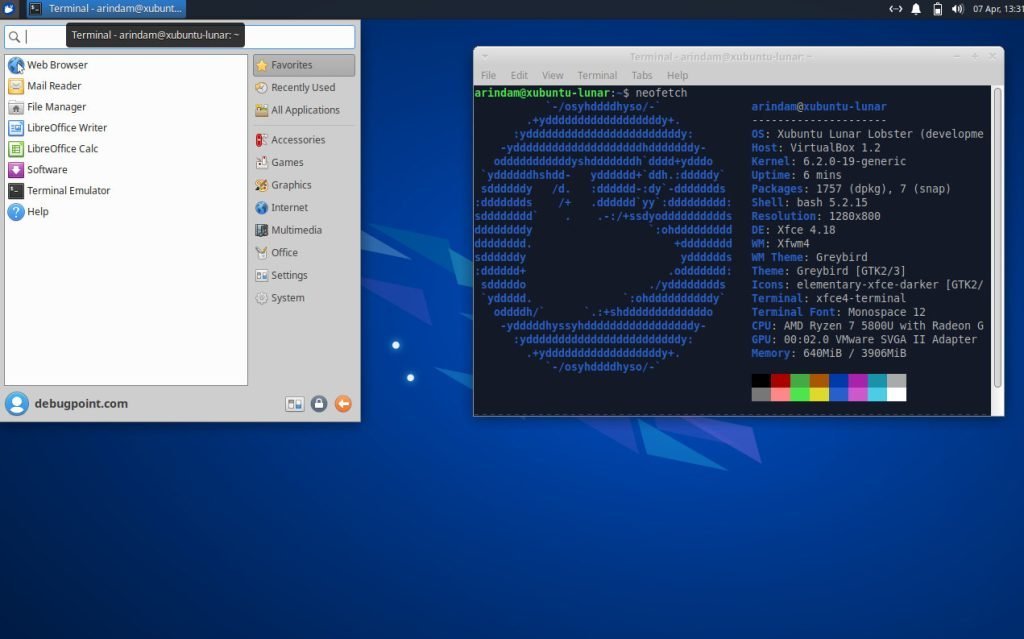
Xubuntu is a Linux distribution that integrates the popular Xfce desktop environment with the Ubuntu operating system. It offers users a lightweight and efficient computing experience with the familiar Ubuntu ecosystem. Xubuntu’s emphasis on the Xfce desktop environment allows for a fast and responsive user interface while conserving system resources.
However, Xubuntu follows Ubuntu’s underlying packages, which include Snap and other Ubuntu desktop applications. If you are OK with those, then Xubuntu is an excellent choice for a stable Xfce-based distro.
You can download Xubuntu from the below page.
EndeavourOS
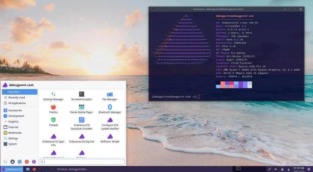
It’s the first Xfce-based distribution based on Arch Linux in this list. Three years back, a small team of contributors started EndeavourOS to continue the discontinued Antergos project. And since then, EndeavourOS has become popular because of its simplicity of installation, user experience and features.
Although several other desktops are available, EndeavourOS comes with the default Xfce desktop environment. The Xfce desktop is a little customized, and you get almost vanilla Xfce with Arch Linux based on this distro.
If you ever tried EndeavourOS, you must have “felt” how “easy” things are to perform on a desktop for the end user, being an Arch distro. The motto of this distro is to be a “general purpose” Arch Linux distribution for the masses, discarding the Arch Linux installation fear for new users and the superiority of using Arch.
It’s the best among other distros which offer Xfce with Arch Linux. You can download EndeavourOS from the below page.
Linux Lite
Linux Lite 6.0, AKA Linux Lite OS, is based on Ubuntu and follows its LTS (Long Term Support) lifecycle. That means you get a similar release schedule and security updates for five years following Ubuntu Linux. The lightweight desktop environment – Xfce is its primary and only desktop. Linux Lite OS primarily focuses on Windows users who want to kick-start their Linux journey. Hence, you may consider it a “bridging” Linux distro.
The Xfce desktop it offers is a little customized with themes, wallpapers and fonts. However, it’s another Ubuntu-derived distro with Xfce. You may give it a try.
You can also read about its performance and other aspects in the Linux Lite review.
Manjaro Xfce
Manjaro Linux is a famous and time-tested distribution which brings Arch Linux to the masses. It is well designed to provide a wrapper to the “Arch Linux is difficult” myth. In addition, once you start using it, you wouldn’t feel it is an Arch Linux. It may feel like a Debian-based or a Fedora-based distro.
Although it offers other desktop environments like KDE Plasma, its Xfce variant is also well-built with an underlying Arch Linux core. If you need another alternative Arch Linux-based distro with Xfce, you can try it.
You can learn more about this distro in several reviews which I published.
Peppermint OS
Next on the list is Peppermint OS, a Debian-stable-based distro that’s ideal for daily use. It includes pre-installed apps to help you get started and has a customized Xfce desktop environment. Previously, Peppermint OS used LXDE but recently made the switch to Xfce.

Other than the Debian base, Peppermint OS features two key applications. The Peppermint Welcome app provides new users with a basic overview of the distribution. The other app, Peppermint Hub, offers shortcuts for managing your system, such as changing themes and downloading software from the repository. If you are new to Peppermint OS, Peppermint Hub can handle most system management tasks from one convenient location.
You can give it a try, but the Xfce desktop experience would be the same as the first one on this list.
Kali Linux
Kali Linux, a well-known distro in the cyber security industry, is based on the Debian testing branch and is a must-have for this list. Although it is for a segment but the default Xfce desktop makes it another candidate in this list.
It is equipped with a variety of specialized tools for penetration testing, vulnerability assessment, and digital forensics. These tools include password cracking, network scanning, and wireless attacks, making it the ideal solution for assessing and securing your systems.
The Xfce desktop environment is heavily customized, which makes it one of the great-looking distributions for everyone. However, it is targeted to specialized use cases. Hence you should only use Kali for those functions.
Which is the best for you?
Well, that depends on your taste and use case. If you are not sure, I would recommend going ahead with Linux Mint Xfce or MX Linux. They should fit for all purposes.
If you have a specific need for Fedora or Arch Linux base, then try Fedora Xfce or EndeavourOS.
And the rest of them might be good for specific use cases which require Ubuntu or Debian-base.
Conclusion
In conclusion, we looked at several excellent Linux distributions which are optimized for the Xfce desktop environment. Whether you are a beginner or an advanced user, these distributions provide a lightweight, efficient, and customizable platform for your computing needs. Each distribution offers unique features and advantages.
I hope you get to find out your favourite Xfce-based distro.
Source: https://www.debugpoint.com/best-xfce-distributions/#


