Elementary OS "Luna" 0.2 Review: Simple, effective, efficient
Like many other Linux users, I too,
follow a lot about Elementary OS. They seems to be getting things right
what's wrong with modern Linux in general and GNOME 3 in particular.
Consider this, it is just the 0.2 release of Elementary and already
ranked 27 in Distrowatch popularity! The 1.0 release is yet to come! As Darshak said in the comments section - it is going to be killer of a distro.
Anyway, I used the 32-bit Elementary OS
Beta 1 release a few months back and was deeply impressed with it. So,
when the 0.2 release note came with some incremental improvements, I
wanted to try it out myself. Elementary OS too, like 70% of all Linux
distros, is based on Ubuntu and to be more precise, on Ubuntu 12.04 LTS
and the present update comes with Linux kernel 3.2.0. However, it
doesn't believe in Ubuntu's Unity philosophy and has come up with it's
own GNOME 3 forked desktop, Pantheon. Even the Files file manager is
forked and named Pantheon Files.
The main USP of Elementary is a sophisticated, uncluttered and uncomplicated desktop. It comes from the same developers who created elementary GTK2 theme for Linux. Elementary OS provides users the basic desktop to work with and customize. I set the expectation right the very beginning itself - if you are expecting a whole lot of applications with all possible codecs/flash installed like other Ubuntu derivatives (incl. Mint), then you'll be disappointed with Elementary.
The release note of Elementary 0.2 states of the following incremental improvements:
Aesthetics
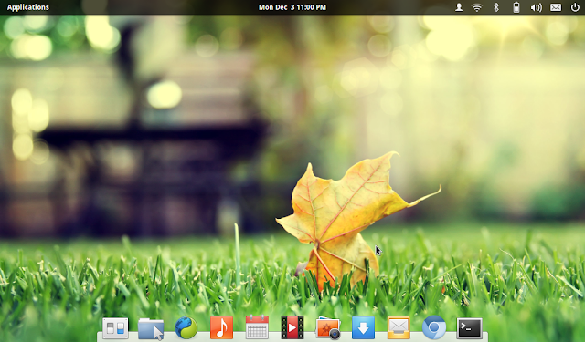
Elementary OS has a very simple and sophisticated interface. Pantheon is a simple Mac OS like desktop with docky at the bottom and a panel at the top. The dock, named as Plank, is derived from Docky and offers a limited range of functionalities. It looks simpler and the typical Docky icon is not there which is good.
Desktop looks a bit naked with no icons
but the default wallpaper really gels with the overall theme. I found
quite a few good looking wallpapers in Elementary as well.
Font rendering of Elementary is really
good and the default font "Raleway" is pleasing to the eyes. Most of the
distracting elements like animations, excess color, gaudy design, etc.
are not there in elementary making it pretty suitable for production
purposes. The menu looks a bit big for my taste - it could have been a
little less in size and covers almost 40% of the desktop when clicked.
The desktop also supports hot corners
for easier use. I don't prefer using a lot of hot corners as it can be
quite distracting as well but it is good to have functionality.
Even the Pantheon file manager (Files) sported of some new enhancements like subtle blue glow of the folder when my cursor was focused on it, more sophisticated folder icons, multi-tab flexibility, etc. It adds to the overall appeal of the distro but sadly, preview function is still missing in Elementary.
I didn't add a conky here just to keep
the desktop uncluttered and as it is. There are a few GNOME 3 legacy
drawbacks which elementary OS till now have like:
Applications
Given the modest ISO size and based on my past experience with Elementary OS beta 1, I didn't expect a whole lot of applications in it. Elementary comes with very basic applications like:
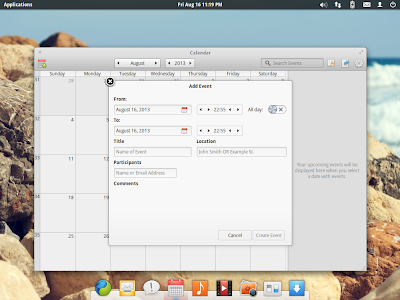
Maya calendar looks simple and easy to
use. However, I expect at least integration with Google calendar to be
more functional and right now it is not that usable for me.
Music player's updated version is better
than the last one (Noise) I used. By the by, Elementary doesn't have
any multimedia codec pre-installed in the distro. However, once you try
to play any music or video file, it downloads the codecs very
efficiently and without any hiccup. I could list all the songs in a
folder by selecting that folder via music player. I could see improved
album art handling, duplicate detection (first time I saw in a Linux
music player), no crashes while playing music for continuously 4 hours a
day for 5 days, and supported music in external hard drive quite well. I
rate music as quite good an application.
The default web browser is Midori, with a very refined interface. Sadly, my experience with Midori in this release was limited as it kept on crashing and could not integrate Adobe flashplugin that I downloaded. However, html5 videos worked fine with Midori (till it crashed!). I installed my favorite browser Firefox with 5-10 minutes of trying my luck with Midori. I know Adobe flashplugin can be integrated with Midori but wanted a browser which just works. Having Midori as the default browser (specially when you're not vying for a lightweight distro) doesn't work for me.
 |
From Elementary 0.2 http://mylinuxexplore.blogspot.in |
The main USP of Elementary is a sophisticated, uncluttered and uncomplicated desktop. It comes from the same developers who created elementary GTK2 theme for Linux. Elementary OS provides users the basic desktop to work with and customize. I set the expectation right the very beginning itself - if you are expecting a whole lot of applications with all possible codecs/flash installed like other Ubuntu derivatives (incl. Mint), then you'll be disappointed with Elementary.
The release note of Elementary 0.2 states of the following incremental improvements:
- Better support of international languages including some Asian languages like Sinhalese
- Multiple display support (didn't test in my review)
- Incremental refinements in design (checked most of them)
- Updated applications like Music player, Pantheon terminal, Midori, Shotwell, etc. (checked all of them, except Shotwell)
Aesthetics
Elementary OS has a very simple and sophisticated interface. Pantheon is a simple Mac OS like desktop with docky at the bottom and a panel at the top. The dock, named as Plank, is derived from Docky and offers a limited range of functionalities. It looks simpler and the typical Docky icon is not there which is good.
 |
From Elementary 0.2 http://mylinuxexplore.blogspot.in |
 |
From Elementary 0.2 http://mylinuxexplore.blogspot.in |
 |
From Elementary 0.2 http://mylinuxexplore.blogspot.in |
Even the Pantheon file manager (Files) sported of some new enhancements like subtle blue glow of the folder when my cursor was focused on it, more sophisticated folder icons, multi-tab flexibility, etc. It adds to the overall appeal of the distro but sadly, preview function is still missing in Elementary.
 |
From Elementary 0.2 http://mylinuxexplore.blogspot.in |
- No right click possible on desktop - even for changing a simple wallpaper, I had to visit the settings manager.
- No icons on the desktop: It looks a bit barren, even short cuts are not allowed. However, the plank makes up for it and users can keep their favorite apps on plank.
- No minimize button: every time doing a right click on the top of the application is a bit inefficient.
Applications
Given the modest ISO size and based on my past experience with Elementary OS beta 1, I didn't expect a whole lot of applications in it. Elementary comes with very basic applications like:
- Office: Calendar, Document viewer, Geary Mail 0.3.1
- Internet: Empathy, Midori browser
- Graphics: Shotwell photo manager, Simple scan
- Multimedia: Totem movie player, Music 0.2.2
- Accessories: Archive manager, Calculator, Screenshot, Scratch 2.0, Pantheon terminal 0.2.3
 |
From Elementary 0.2 http://mylinuxexplore.blogspot.in |
 |
From Elementary 0.2 http://mylinuxexplore.blogspot.in |
 |
From Elementary 0.2 http://mylinuxexplore.blogspot.in |
 |
From Elementary 0.2 http://mylinuxexplore.blogspot.in |
 |
From Elementary 0.2 http://mylinuxexplore.blogspot.in |
 |
From Elementary 0.2 http://mylinuxexplore.blogspot.in |
The default web browser is Midori, with a very refined interface. Sadly, my experience with Midori in this release was limited as it kept on crashing and could not integrate Adobe flashplugin that I downloaded. However, html5 videos worked fine with Midori (till it crashed!). I installed my favorite browser Firefox with 5-10 minutes of trying my luck with Midori. I know Adobe flashplugin can be integrated with Midori but wanted a browser which just works. Having Midori as the default browser (specially when you're not vying for a lightweight distro) doesn't work for me.
 |
From Elementary 0.2 http://mylinuxexplore.blogspot.in |
 |
From Elementary 0.2 http://mylinuxexplore.blogspot.in |
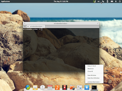
Further, I was impressed with Pantheon terminal. It is transparent, looks cool, gives muti-tab facility and very stable. It is better than the boring terminal in Ubuntu.
 |
From Elementary 0.2 http://mylinuxexplore.blogspot.in |
 |
From Elementary 0.2 http://mylinuxexplore.blogspot.in |
 |
From Elementary 0.2 http://mylinuxexplore.blogspot.in |
 |
From Elementary 0.2 http://mylinuxexplore.blogspot.in |
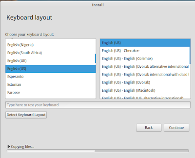
Installation is typical Ubuntu and no surprises there. Installer looks like a typical Linux Mint one. Questions are usual about language, location to install, keyboard preferences, geographic location and user ID creation. It took me about 20-25 minutes to get Elementary installed on my laptop.
 |
From Elementary 0.2 http://mylinuxexplore.blogspot.in |
 |
From Elementary 0.2 http://mylinuxexplore.blogspot.in |
 |
From Elementary 0.2 http://mylinuxexplore.blogspot.in |
 |
From Elementary 0.2 http://mylinuxexplore.blogspot.in |
 |
From Elementary 0.2 http://mylinuxexplore.blogspot.in |
 |
From Elementary 0.2 http://mylinuxexplore.blogspot.in |
Elementary correctly recognized my laptop's touchpad and screen resolution. Wifi was detected immediately in the 64-bit version whereas the 32-bit couldn't. 32-bit beta1 version worked well with me earlier. Possibly I should have downloaded the 32-bit version again but I didn't have the patience.
Repository
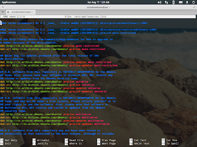
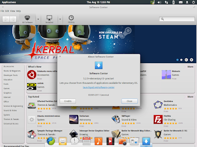
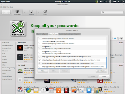
Elementary sources applications from Ubuntu Precise repos. The default GUI looks like Ubuntu Software Center but it is rebranded. I didn't find synaptic package manager in Elementary and it has to be downloaded.
 |
From Elementary 0.2 http://mylinuxexplore.blogspot.in |
 |
From Elementary 0.2 http://mylinuxexplore.blogspot.in |
I could install Firefox browser, Adobe flashplugin, GIMP and LibreOffice without any issue using the Elementary Software center.
Performance
The 64 bit Elementary OS surprised me by it's efficiency and responsiveness. At steady state, it consumed about 340 MB RAM and 1-5% CPU to load the Pantheon desktop with htop running. The 32-bit Beta1 consumed about 300 MB RAM in my previous benchmarking test, on the same machine and under identical conditions. Unfortunately I couldn't get the 32-bit version going this time - otherwise, it would have been a nice comparison.
Below table compares Elementary OS to two other 64-bit distros I checked this year, Pear OS 7 and Netrunner 13.06 - RAM and CPU utilization recorded on the same laptop and under almost similar conditions. Pear OS 7 performs marginally better than Elementary OS 0.2.
| Operating System | Size of ISO | Base | Desktop | Linux kernel | CPU Usage | RAM usage | Size of installation |
| Pear OS 7 (64 bit) | 1.1 GB | Ubuntu | Gnome 3.6 with Docky | 3.8.5 | 1-5% | 315 MB | N/A |
| Elementary OS 0.2 (64-bit) | 728 MB | Ubuntu | Pantheon, Gnome derivative | 3.2.0 | 1-5% | 340 MB | 2.87 GB |
| Netrunner 13.06 KDE (64bit) | 1.4 GB | Ubuntu | KDE 4.10.3 | 3.8.0 | 1-10% | 410 MB | 5.7 GB |
Overall
I had a really pleasant experience with Elementary OS 0.2. It's simple but aesthetically pleasing design actually intrigues me. Right now I am not using it for production purposes but I may when the 1.0 release comes out. Pantheon is definitely better than GNOME 3 distro or Unity, but I would like to see a few add-ons like:
- Right click on the desktop to do simple things like changing wallpapers, etc.
- Supporting folders, icons, etc. on desktop - I don't like naked desktops.
- Preview function to be added to the file manager - it actually helps in working faster.
- Add minimize button to applications - it is more efficient.
- Plank is not customizable much right now - I would like to see a few customization options for the plank.
- Calendar is not much usable right now - Google or Facebook integration is in my wishlist.
- Scratch needs a bit of improvement to make it more usable.
Definitely an improved design, Geary mail, pantheon terminal and music players are plus points for me in the 0.2 release. User experience is right now very good in Elementary and I feel it is almost there to be a dependable and reliable operating system for daily use and production purposes. It has some elements of originality about it which I don't see in a majority of the Ubuntu derivatives.
Those who wants to try out Elementary OS 0.2 can download it from here.
Source: http://mylinuxexplore.blogspot.com/2013/08/elementary-os-luna-02-review-simple.html
A week with elementary OS Luna: Could this be the start of something big?
It is not far-fetched to say, open source and its poster child, Linux, is going through a golden period. The emergence of internet has a lot to do with the popularisation of open source way of thinking. But in the world of Windows and Macs, what makes Linux tick? Redhat was the first to explore Linux's potential. But Redhat had a very enterprise centric approach. And in 2004, Ubuntu came along with the focus firmly back on end-users. This kick started a flurry of activity and a number of new Ubuntu based Linux distros started to sprung up. The latest one being elementary OS Luna. And this brand new OS has a lot going for it.
elementary OS Luna Preview
Even without a single release, elementary OS had a pretty huge fan
following. This was mostly because of the team's early focus on a
polished UI, which became an instant talking point among casual as well
as experienced Linux users. Moreover, projects like Nautilus-Elementary
(which evolved to become Marlin file browser later on), elementary GTK
theme etc. were massively popular among users long before elementary OS
project was even introduced. Does the OS live up to the hype? We'll soon
find out.
A week with elementary OS Luna beta 1
We have been doing reviews of popular Linux distros
for sometime now. But this time I've decided to do it slightly
different. I've decided to use nothing other than Luna OS in my netbook
for a full week and see how it fared against my favorites such as Ubuntu
12.04 LTS, Ubuntu 12.10, Ubuntu GNOME Remix and the likes on daily use.
It is worth noting that, Luna OS has not hit the final release yet and
is still in beta. But good enough for daily use in my opinion, and
definitely good enough for a full blown review.
Starting from the boot splash screen, Luna OS maintains a consistent
theme and level of polish unlike any other Linux distro I have tried,
through all these years. The LightDM based login screen looks good as
well, but I prefer a more simplistic and functional login window, like
the one you find in the latest Ubuntu 12.10 Quantal Quetzal.
Boot Speed
Since Luna OS come installed with Preload by default, and since Preload has a very bad reputation in the boot speed area specifically, I was not expecting anything drastic. But to my surprise, elementary OS Luna fared pretty good, actually even a tad better than both Ubuntu 12.04 and Ubuntu GNOME Remix in my netbook. But not much to have any significant impact.
Ubuntu 12.10 Quantal Quetzal: 38 seconds to reach login screen.
Ubuntu GNOME Remix: 30 seconds to reach login screen.
Xubuntu 12.04 LTS: 27 seconds to reach login screen.
elementary OS Luna Beta 1: 25-32 seconds (fluctuates more than the others)
Clean, Simple Desktops Always Look Good
I mean, look at that, how much cleaner and simpler a desktop could ever get?
Extensive Support for Keyboard Shortcuts Already
No matter what desktop I'm using, I need keyboard shortcuts to get hang of it. I don't like messing around with touchpad a lot. It was difficult initially since I couldn't find anything about keyboard shortcuts in Luna OS. But soon enough, they were announced in an official blog post. That made everything a lot simpler and I've started to really like this OS.
Multitouch Support for Trackpad Enabled by Default
This was a surprise. Initially I thought my trackpad was not working (for scrolling), which was kind of a shock since it used to work with all kinds of OSes out there. But then I found out that, in elementary OS Luna, two finger scrolling (both vertical and horizontal) is enabled by default. I tried it and it worked like a charm! Nice touch I say.
UI Design and the Overall User Experience
The menu has a simple, uncluttered layout and is very easy to use. There is nothing complicated about it. You can even sort the apps further into categories.
Luna's default dock looks nice and has a more straight-forward approach when compared to Unity's launcher/dock. But I still prefer Unity's launcher over this anyday. It has way more functionality (quicklists, download status bar, keyboard shortcuts etc.) and feels much more sophisticated. But I don't think Luna's Plank dock menu is even trying to compete with Unity. It is meant to be simple, and most users won't even notice the lack of extra functionalities.
And Plank's settings can be found in the System Settings - Desktop menu. You can set it to auto hide, intelligent hide, hide on maximize or never hide mode.
A collection of 24 beautiful wallpapers have been included. But right click menu is disabled by default while in the desktop and hence there's no easy access to wallpaper settings, like in Ubuntu. You have to go to System Settings - Desktop menu to access it.
Hot Corners: A very nifty addition to an already robust desktop. I used to add this in Ubuntu all the time with the help of Ubuntu Tweak. Accessible via System Settings - Desktop again.
A beautiful retake of GNOME Shell's overview mode for workspaces. Works very well and looks fantastic. See elementary keyboard shortcut's screenshot above to learn enabling and disabling of workspaces overview mode in Luna OS.
Choice of Apps:
Plenty of new applications, some even custom designed by elementary team, has made it to elementary OS Luna beta 1 release. They include:
Not much long ago, when we did a quick review of Marlin file browser, it was still very much a work in progress. It lacked many critical functionalities and overall polish.
Even the animations that has been added to "breadcrumbs" feature is so simple, elegant. If you are someone who loves the attention-to-detail factor, Marlin file browser alone is going to surprise you in so many different ways.
Midori Web Browser
Midori is my second favorite new app after "Files" in Luna OS. No matter which web browser I use, I have a tendency to go back to Chrome/Chromium and Firefox. But I think I'm going to stick with Midori for sometime eventhough I don't particularly like its default search engine (which is DuckDuckGo) and there seems to be no easy way to change that apparently. UPDATE: You can change the search engine in Midori easily by right-clicking the address bar.
Geary Mail Client
Not a user of desktop mail clients, so couldn't really comment on this particular app.
Another app that I'm probably never going to use. Maya is a calendar app custom built for elementary Luna OS. It definitely looks nice and feels very modern.
Noise: A very basic Music app that just works.
Other default apps for elementary Luna OS include: Scratch text editor, Shotowell Photo Manager (no Image Viewer),
Some new terms you have to get accustomed to:
Pantheon: Luna's new desktop environment and shell (consists of the greeter, panel, app launcher, dock, window manager, settings app, and theme).
WingPanel: It's the panel in Luna.
Slingshot: Luna's new app launcher.
Gala: Replaced Compiz as new default window manager in Luna OS.
Wrap-up
The moment you boot up Luna OS, one thing becomes clear. This is a Linux distro that has been made with lot of love. Luna OS might just be the first desktop OS based out of Linux with a firm focus on making a consistent UI more than anything else and a no-compromise approach on quality of custom apps. So, could this be the next big thing in Linux? I honestly don't know. But Luna OS shows a lot of potential and hope it continues to evolve just as well. This is one distro you have got to keep an eye on. Our hearty congratulations to the entire elementary team for a job well done! And thanks for reading.
Source: http://www.techdrivein.com/2012/12/elementary-os-luna-review-full.html
